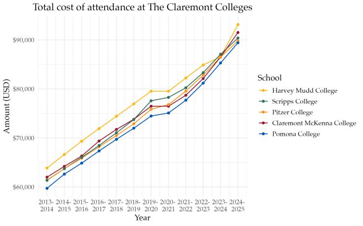
Unfortunately my graphic didn’t make it into the print version, but it’s in the online version of the article! Made using R.
Human-generated, always. Since January 2024.
Unfortunately my graphic didn’t make it into the print version, but it’s in the online version of the article! Made using R.
