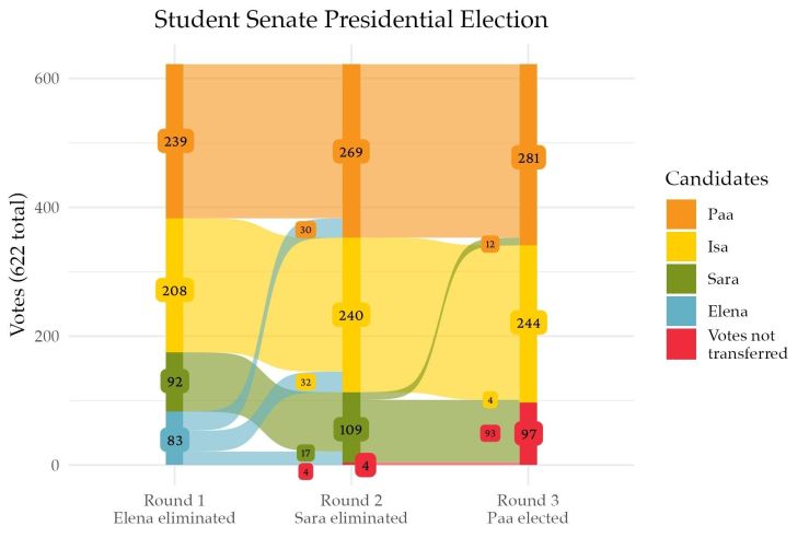
This graphic also didn’t make it into the print version, but it’s up online! Made using R with some additional labeling done manually.
Visualizing ranked choice voting data was a fun challenge, and while I ended up having to do some work outside of R to get it looking exactly how we wanted, figuring out how to reshape the data so geom_alluvial() would plot it correctly was a fun puzzle.
