Data visualization for The Outback’s article on Pitzer’s student senate election

Data visualization of ranked choice voting. Paa maintains a plurality between all three rounds, and wins a majority in the third round. Elena was eliminated first, then Sara, leaving Isa and votes that were not transferred in the third round. 622 votes were cast in total.

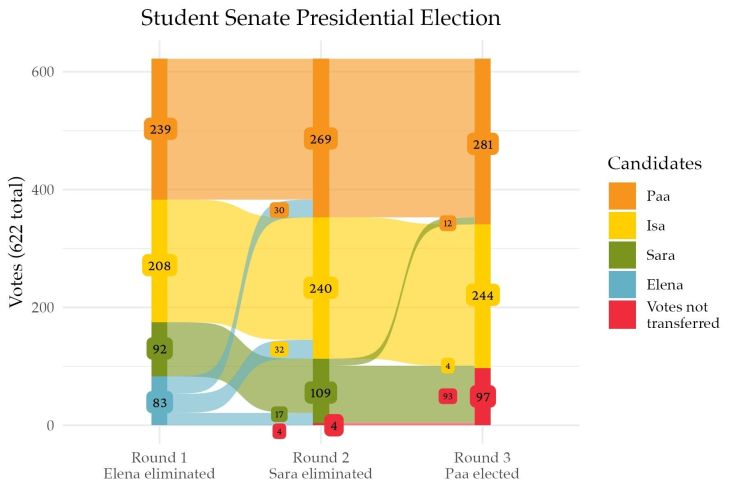
This graphic also didn’t make it into the print version, but it’s up online! Made using R with some additional labeling done manually.

Visualizing ranked choice voting data was a fun challenge, and while I ended up having to do some work outside of R to get it looking exactly how we wanted, figuring out how to reshape the data so geom_alluvial() would plot it correctly was a fun puzzle.

Mines and Water Quality in Nevada: A GIS Analysis

I finally got my term project for the GIS for Data Science class I took in Fall of 2022(!) up on GitHub. It was my first real experience with the “data science is 90% data cleaning, 10% fun stuff” thing and I certainly learned a lot!

I’m blessed with an Esri license through my school, so the analysis uses arcpy, the ArcGIS API for Python, and Spatially Enabled DataFrames. The final product was a writeup with some data visualizations and more extensive data communication through an ArcGIS (Jupyter) Notebook, both of which are now hosted publicly on GitHub along with the geodatabase with the data I used.